Praci Web
Workforce management software for staffing agencies and the clients they serve.
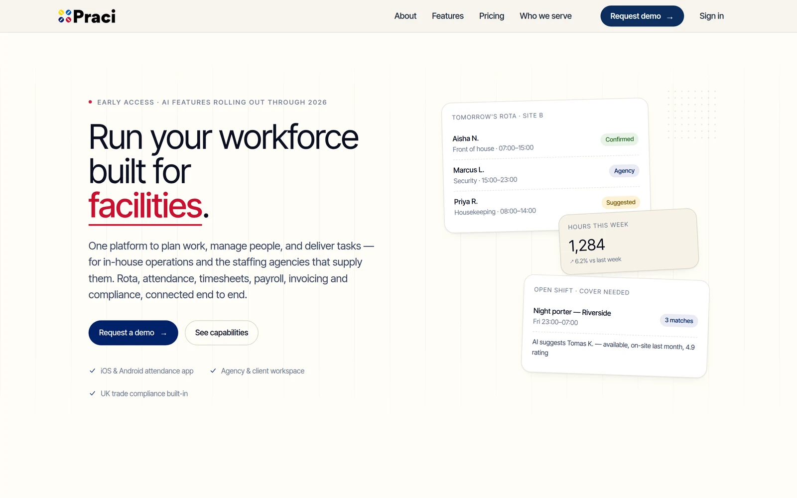
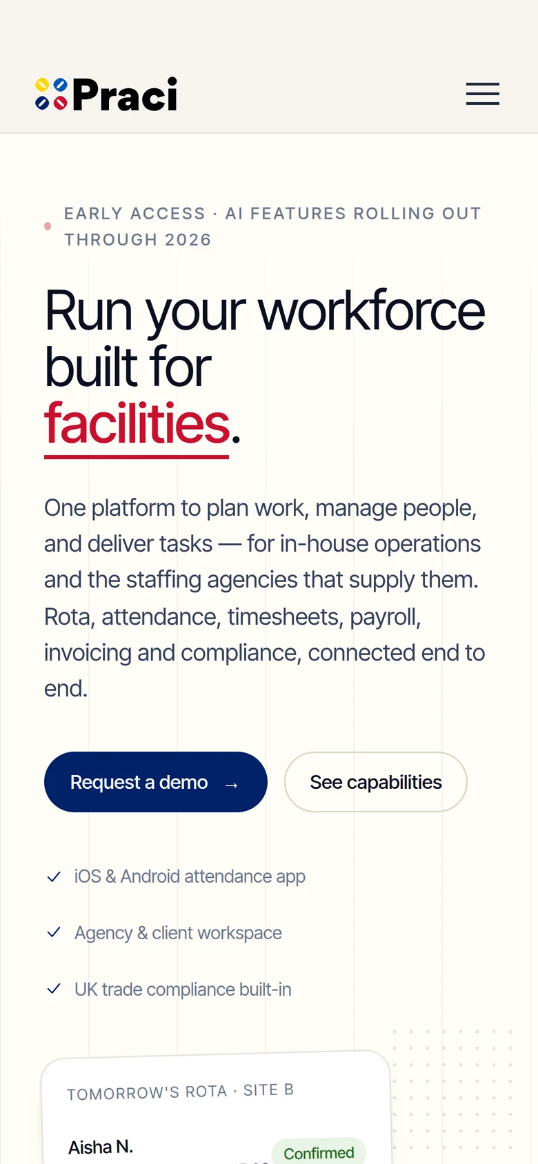
The marketing website for Praci, a workforce platform that plans work, manages people and delivers tasks for in-house operations and the staffing agencies that supply them. It explains the product to two audiences at once and turns interest into demo requests.
The problem
Praci serves two sides of the same relationship, agencies and the clients who hire them. The site had to explain rota, attendance, timesheets, payroll, invoicing and compliance clearly without overwhelming either audience.
The goal
Make the value obvious in the first screen, speak to both agencies and service providers, and make requesting a demo the clear next step.
Discover
Separated the two audiences, agencies and service providers, and listed what each needs to see to trust the product.
Design
A confident navy, red and yellow palette on warm white, with a bold headline that rotates through industries and floating rota cards that show the product.
Build
A fast, responsive marketing site with animated hero content, a two-sided comparison section and a structured capabilities grid.
Ship
Launched with demo request and pricing paths, and a cookie notice.
A hero that shows the product
A headline that rotates through industries beside live-looking rota, hours and open-shift cards, with a clear Request a demo button.
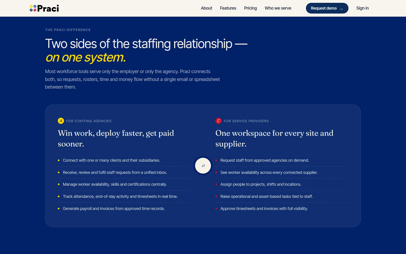
Two sides, one system
A side-by-side section explains what staffing agencies and service providers each gain, from one unified workspace.
Capabilities and industries
Six core capabilities and six industries, from hospitality to security, are laid out as scannable cards, followed by a three-step How it works.
ReflectionWhen a product serves two audiences, the site has to make both feel it was built for them. Showing both sides together did that better than any feature list.